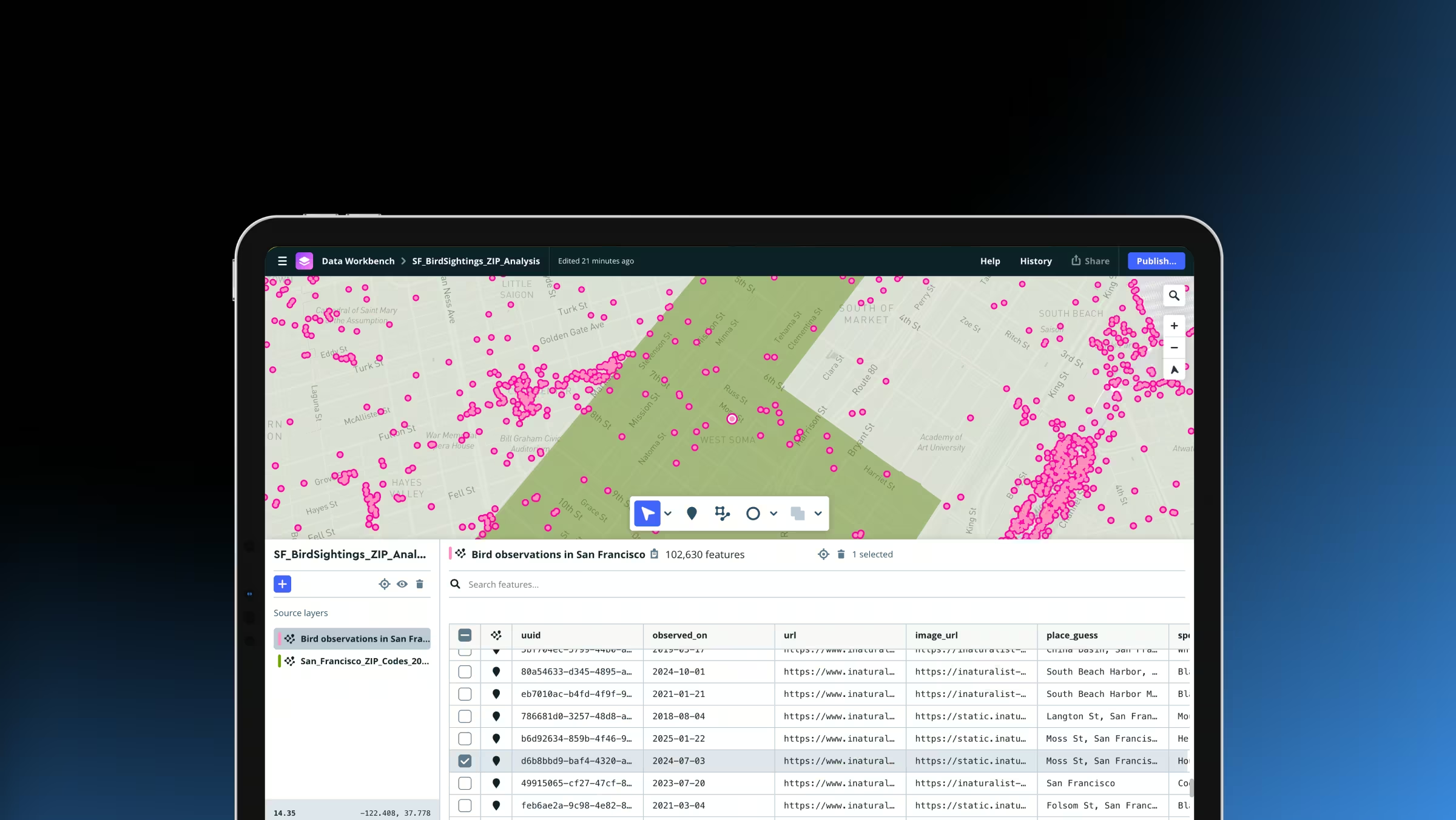
Simplify custom mapping workflows with Data Workbench
Upload, edit, preview, and publish custom geospatial data in one streamlined workflow. The new Mapbox Data Workbench simplifies data preparation, tileset configuration, and design, helping developers move from raw datasets to production-ready maps faster than ever.

Full design control
Add your own fonts, icons, and textures to make your map fit seamlessly with your brand.
Data visualization
Import your own data to make choropleths, scaled point maps, and more.
Publish across platforms
Use styles with Mapbox SDKs for iOS, Android, the web, and embedded devices.

Design life-like landscapes, no code required
Instantly create realistic maps by combining 3D styling with sky features. Mapbox Studio brings all the rendering power of Mapbox GL in simple toggles and controls.
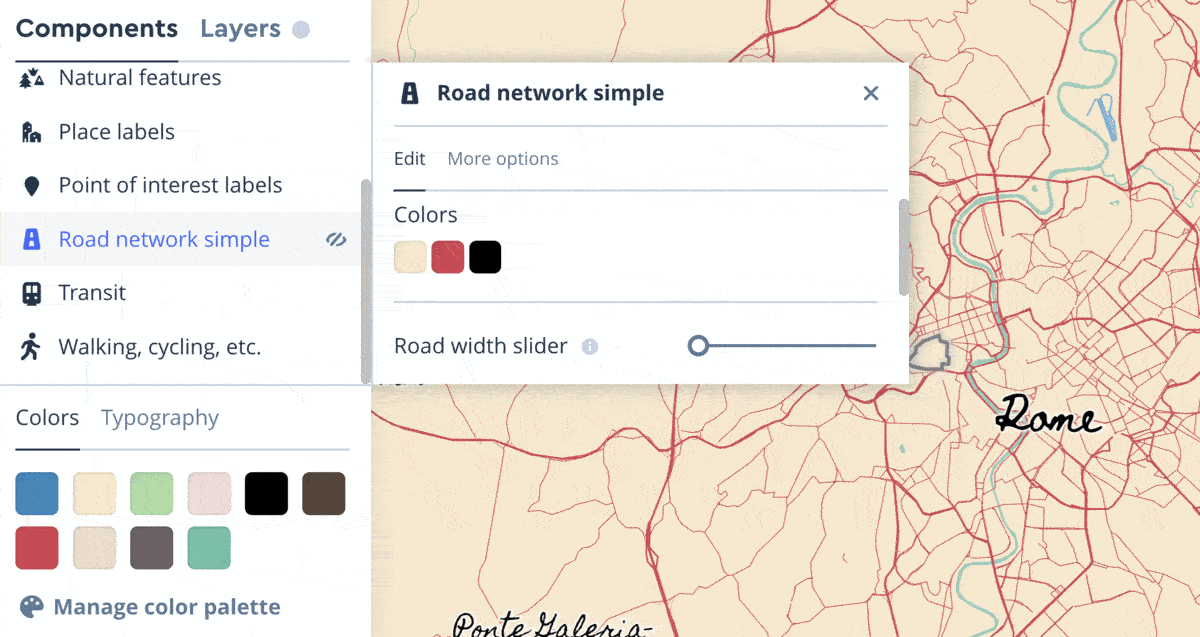
Dive into custom map design, no experience required
Control your map design through a curated set of components for color and typography. Style multiple data layers at once with intuitive sliders for road width, POI density, and more. Organize your styles in folders for more efficient project and team management.
“I can now do in eight minutes what used to take eight hours. You’ve made it almost too easy to style and make beautiful maps.”

Swap color palettes

Style the sky

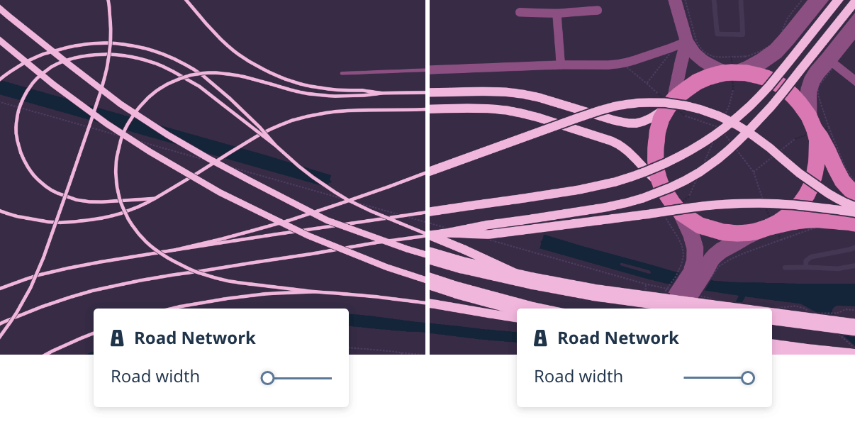
Adjust road width
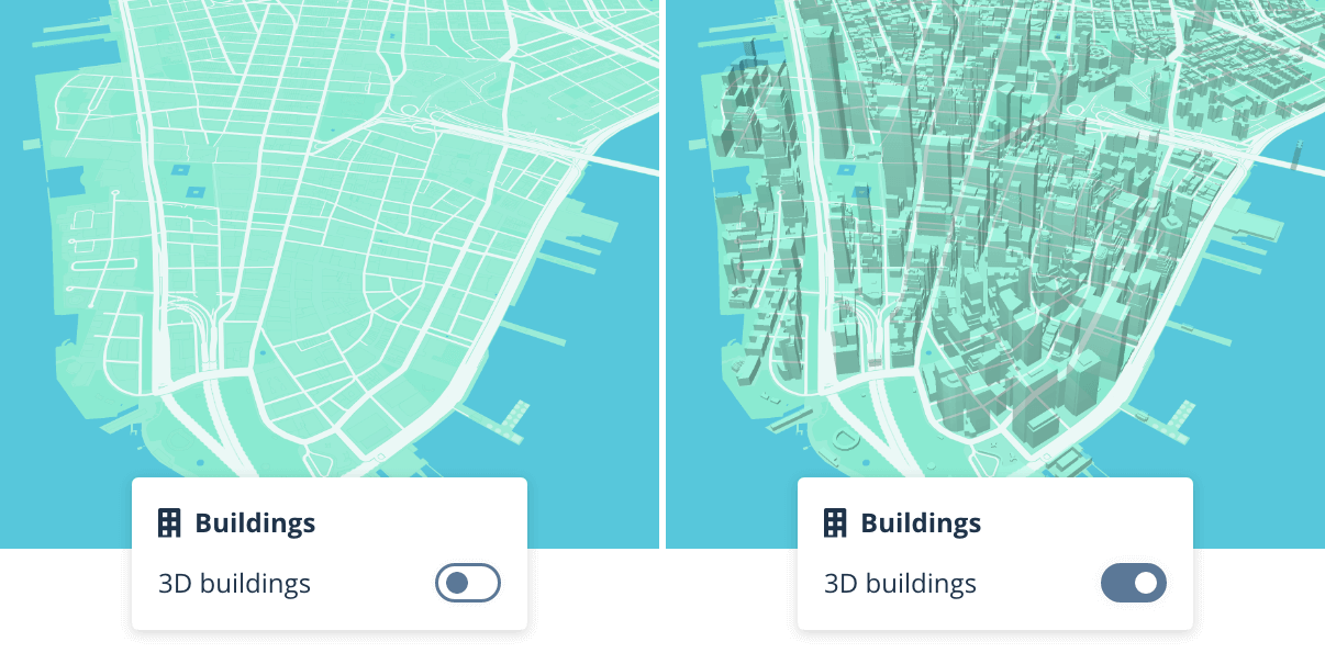
Add 3d buildings
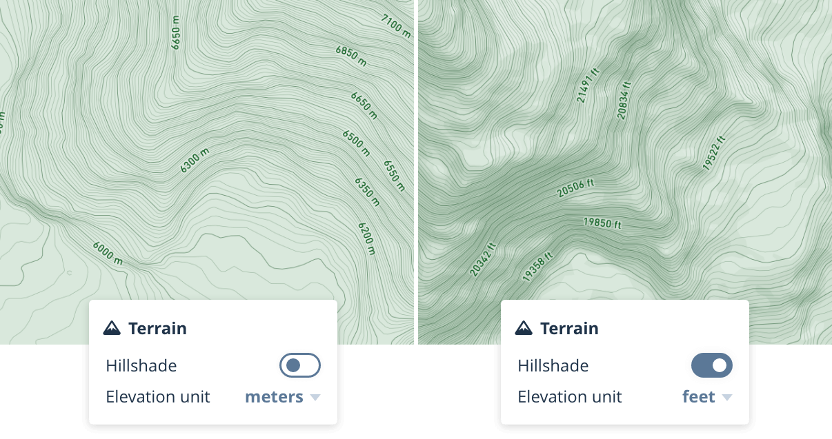
Add terrain
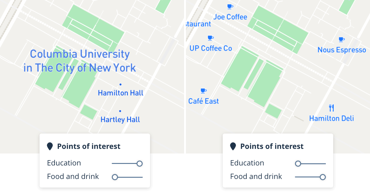
Show POIs by category
Design for your brand and use case


FAQs
What is Mapbox Studio?
Mapbox Studio is a suite of applications for designing custom map styles and managing your location data. Use Mapbox Studio to build and design a map to your exact specifications by uploading and editing your own data, utilizing Mapbox-provided tilesets, adding custom fonts and icons, or refining the built-in core styles. With Mapbox Studio, full data management and design control are at your fingertips.
What can I do with Mapbox Studio?
Mapbox Studio gives you full control over styling interactive maps through the style editor. You can tweak the colors and fonts on a core style in minutes and start using the map in an app or website, or you can build your own map style from the ground up with custom data and carefully crafted style layers.
Mapbox Studio also lets you import data to use in your styles. When you import data into Mapbox Studio, your data is converted into vector tiles. Supported formats include Shapefiles, geoJSON files, CSV files, and more.
Finally, Mapbox Studio includes a dataset editor that lets you manage your own datasets. The dataset editor makes it possible to add point, line, and polygon features with draw tools. It includes a property editor for adding custom fields to your features. In Mapbox Studio, datasets can be converted to tilesets and then used in styles.
What are Style Components?
A Style Component is a group of associated layers that together represent a common cartographic feature. “Roads” and “Place labels” are examples of components. Components wrap thousands of decisions made by our cartographers into a simple, curated set of controls for color, typography, and feature density.
Each component includes built-in styles, as well as a set of options unique to the features the component contains. For example, the “Roads” component allows users to toggle traffic on or off, or to change the style of highway shields from a predefined set of styles. A “Place labels” component on the other hand, offers users the option to adjust label density or show or hide icons next to place labels. The options within each component are designed by cartography experts at Mapbox to be as meaningful and impactful as possible.
What are the benefits of the Style Components in Studio?
Components make customizing maps easier and faster in Studio by reducing the number of decisions needed to get the desired outcome.
How do I start using Style Components?
Any new style you create in Mapbox Studio will automatically have components enabled. All of our core styles have been rebuilt using components. Each core style leverages components in their own way – setting properties, colors and more to provide the best starting point for you to customize your map.
How do the color and typography settings work?
Color and typography settings are shared across every component in a style. When you make changes to color or typography settings on a style, those changes always apply across every component. This makes it easier to keep your map’s styles synchronized.
Can I customize the map in ways that aren’t supported using just the components interface? For example, can I change the zoom level styling set by components?
Yes, for any styling beyond the simple selections in components, you can customize any of the properties controlled by components through overrides.
Overrides give you control over those finer details you want control over, but without losing the overall benefit of the controls provided by components. You can override a property and also reset a property back to being controlled by the Component. It’s easy to experiment this way with little risk to the overall style.
Do I have to use components for a new style?
When you pick from the list of core styles, they will by default use components in the new Studio. If you want a full custom layer editing experience in lieu of a component, you can remove the component properties through a feature called ejection. Ejection ungroups the layers that formed the component and returns those layers to free form styling options. Once a component has been ejected, you cannot add the component back to your map, so only eject if you’re sure you want complete control.
Can I add and remove components from my style?
Yes, you can add and remove components from your style similarly to how you would add or remove layers. Components have pre-determined positions where they will be added to your style so cannot be reordered, however you may reorder custom layers around them.
Can I bring & style my own custom data?
Yes, similar to the current Studio, you can bring and style your own custom data. Create data visualizations of points, lines and polygons with the Data visualization component. In addition to components, you can also add your own data as a layer in the “Layers” panel in and click the “Add new layer” button.
Has the workflow changed for layer editing?
No. In the Studio, we have 100% support for all previous layer editing capabilities.
How performant are styles made with components in comparison to styles only made with layers using expressions?
In your app, website, or embedded device, styles made with components are no different from any other type of style. There should be no performance differences.
Do Component styles work with the Maps SDK for Web, Android, and iOS?
Yes. Studio fully supports all features in Mapbox GL. Styles made with components will work with the Maps SDK for Web v1.0+, iOS v5.0+, and Android 8.0+.
The renderer will fetch the new style from the server and parse and load it as a regular style. When published from Studio, styles with components will be compiled into the same stylesheet format as older styles.
Can Component styles be used with runtime styling in my app?
Yes. All styles using components will be compiled into the same stylesheet format as before and all layers in the style are available for runtime styling as before.
My existing styles use layers, how do I get them to use components instead?
Styles created before Studio will continue to be fully supported with Studio’s layer editing feature. All new styles created in the Studio will use components. To use components with a previously created style, that style must be recreated by selecting and customizing one of the core styles from Studio.
Can I migrate my current style to use components?
Components control multiple layers at once and have a special means of propagating changes to dozens of layers. The component properties that drive these changes are specific to our core styles and cannot be applied to custom styles created previously.
Can I author my own components?
Not at this time. We are excited about the long term opportunity around externally authored components and would love to hear your feedback about how creating your own components can benefit your use case. Please contact support@mapbox.com for any questions or to submit feedback.
How do I get access to the Studio?
All Mapbox users can access Mapbox Studio.
How do I opt out of the Studio?
Since Studio includes full backwards compatibility with previous versions of Studio, it is not possible to opt out. However, we would love to hear feedback on your experience with the Studio if it’s causing you frustration. Please contact support@mapbox.com for any questions or concerns.
What can I do once I publish a style in Studio?
Styles published through Studio benefit from Mapbox’s globally distributed scalable infrastructure and are ready to be used in all of Mapbox’s SDKs and APIs through the Mapbox Styles API. It’s also possible to download your stylesheet to embed directly in your app’s source code. Finally, it’s possible to export high resolution images of your style for print.
Can I transfer a style from one account to another account?
Yes, any published style may be copied from one account to another account, so long as the style is made public. Once a style is public, allow another user to copy the style by sharing the “allow copying” link from the style share panel with any other Mapbox user. The “allow copying” link opens up a webpage that includes a preview of the style and a button that triggers the copy action. Check out our how-to video for a step-by-step guide.
Ready to get started?
Create an account or talk to one of our experts.