Expanding spatial intelligence in Tableau with Mapbox
A recap of Tableau’s BUILD with Mapbox 2026 session on deeper geospatial analysis with Mapbox APIs
For years, Tableau has used Mapbox to power maps and geospatial visualization for its users. Now, Tableau is building on that foundation to bring deeper spatial analysis directly into the analytics experience
At BUILD with Mapbox 2026, Jim Walseth, Lead Member of Technical Staff (Software Engineering) at Tableau, a Salesforce company, demonstrated how Tableau is expanding its use of Mapbox APIs to help users analyze drive times, customer catchments, service coverage, demographics, and other location-based relationships – all within Tableau’s fast, interactive workflow. Watch the full session recording in the Zoom Lobby.
Today, Tableau operates Mapbox-powered mapping at significant scale.In one recent week alone, Tableau served roughly 4 million maps, all backed by Mapbox vector tiles.
Building on years of Mapbox-powered mapping
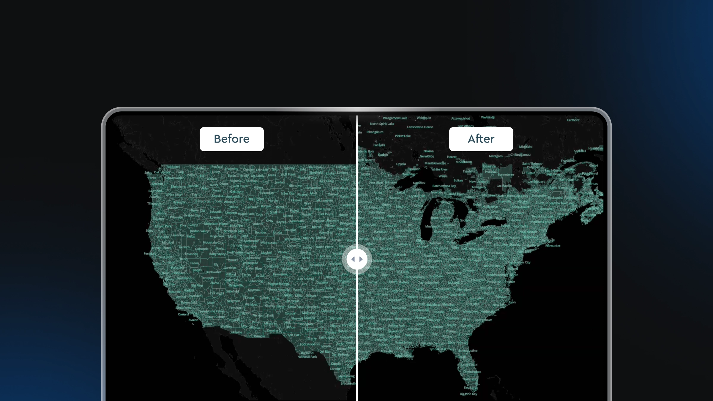
Mapbox has long provided the basemap experience within Tableau, while Mapbox Boundaries provides global geopolitical, administrative, postal, and other polygon data for geospatial analysis. Together, these capabilities help Tableau users connect business data to geography – whether they are creating a map visualization, analyzing sales territories, understanding service areas, or associating locations with geographic regions.
At BUILD, Jim showed how Tableau is taking that relationship further by integrating additional Mapbox APIs directly into analytical workflows.
Making drive-time analysis part of the Tableau workflow
One of Tableau’s newest integrations uses the Mapbox Isochrone API to bring drive-time selection directly into a map.
Tableau has long allowed users to make a circular selection around a location. But while a radius can show what is physically nearby, it does not represent how people actually travel through a road network.
Drive-time analysis adds that real-world context.
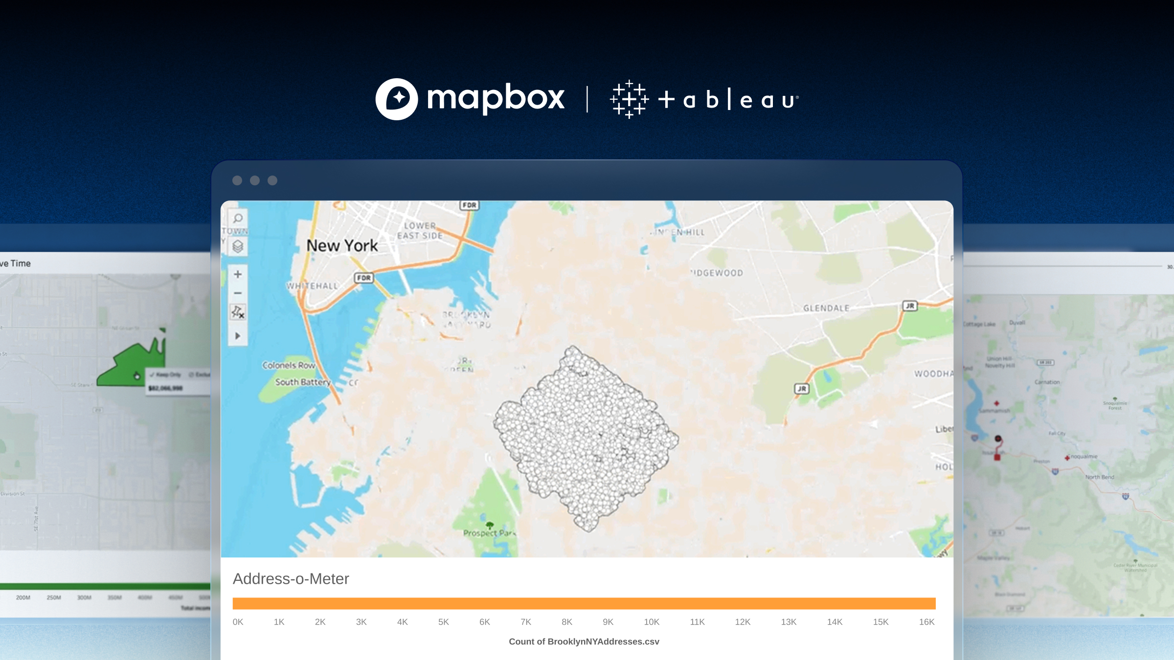
With Tableau’s new isochrone selection tool, users can select a starting point and drag outward to define a travel time. Tableau uses Mapbox routing and isochrone capabilities to determine the area that can actually be reached through the road network.
In Jim’s example, an eight-minute drive contained approximately 10,400 addresses. The analysis can also reveal relationships that simple distance might miss. A location that appears less accessible geographically may actually have strong connectivity because of a nearby highway or road network.
As Jim described it, the implementation is intentionally a “lightweight, in-the-flow-of-work feature,” making drive-time analysis another natural way to select and explore data within Tableau.
Turning drive times into deeper location analysis
Jim next demonstrated how the same Mapbox capabilities can support much heavier spatial analytics.
Using 18 retail locations in Portland, Oregon, he generated drive-time areas and compared them with census tracts containing household income data.
Users could switch between drive times and analyze the potential household income within each store’s surrounding area. Behind the visualization was a much more complex spatial workflow. With 18 locations, 10 drive-time intervals, and 820 census tracts, the analysis required approximately 148,000 intersection calculations.
Jim used the Tableau Prep Builder to perform those calculations before bringing the resulting dataset into the visualization. Using Python through TabPy, he called Mapbox APIs to generate locations and isochrones and then prepared the spatial data for analysis. The result combines what Jim called “heavy analytics” with the responsive, interactive experience Tableau users expect.
Analyzing service coverage with Mapbox travel times
Jim closed with another great example inspired by a Tableau customer question: given a set of service providers and sites, which providers can reach which sites within a given amount of time?
For the demonstration, he used electrical contractors as one dataset and electric vehicle charging stations as another.
For this analysis, Jim calculated a matrix of travel times between service providers and sites using Mapbox. The resulting visualization acts almost like a dispatcher tool. Users can change the maximum travel time – from 30 minutes to an hour, for example – and immediately see which providers can reach each location and where coverage gaps remain.
For interactive workflows like these, API performance matters. Tableau can make repeated Directions and Isochrone API calls as a user interacts with the visualization.
As Jim put it:
“Very fast, very reliable, and that’s what’s really made this feature possible.”
Explore the Tableau examples
Many of Jim’s mapping and spatial analytics examples are available through Tableau Public, Tableau’s free online platform for exploring and sharing visualizations.
Users can download Tableau Public workbooks, open them themselves, and see exactly how the visualizations were built,including the techniques used to integrate spatial data and Mapbox APIs. Explore Jim Walseth’s examples on Tableau Public.
Expanding spatial intelligence in Tableau
Tableau’s work with Mapbox started with a powerful foundation: helping users visualize their data on fast, detailed maps. Now, that relationship is expanding from mapping and visualization into deeper geospatial analysis.
By incorporating Mapbox APIs into Tableau workflows, analysts can ask more sophisticated location questions about travel time, accessibility, customer catchments, demographics, and service coverage – while staying within the interactive analytics environment they already use.
Explore Mapbox Isochrone API and Mapbox Boundaries to learn how Mapbox can bring deeper spatial intelligence to analytics applications.


Related articles
Drag, drop, edit, publish: A simplified workflow for custom data
Mission-ready mapping: Securely bring together maps, AI, and response