How to utilize Mapbox Movement data for mobility insights

A guide for analysts, data scientists, and developers
OVERVIEW
Mapbox Movement is the world’s most comprehensive privacy-forward location dataset. It provides a high-definition view of how, where, and when people move through a city or specific geography. Over the past few months, we’ve used Mapbox Movement data to look at activity during the peak of pandemic shutdown in early April, the 2021 United States Presidential Inauguration, and the re-opening and recovery process for retail commerce.
Late last year, we released a full year of the Mapbox Movement data in the US, Germany, and Great Britain, available for free to any Mapbox Developer here. In this blog post, we will walk through a real-life example analysis of this data. We will show you how to access this data, how to visualize it (no code experience needed!), and how to analyze activity at various business locations (in our example, major airports).
At the end of this tutorial, you will be able to apply these methods to analyze any number of industries and problem spaces to get your own interesting insights, similar to ones we’ve done in the retail recovery analysis. All steps in this tutorial, including the map visualizations, can be done in a single Python Jupyter notebook. You can find the public notebook and more details about the code on GitHub and on AWS S3.
WHAT WE’RE GOING TO DO
First, we are going to take a quick look at Mapbox Movement sample data to understand how to access and visualize this data with little to no code. Next, we will use the coordinates and some attributes from OurAirports’ latest airport dataset to find interesting airports to run our analysis on. Based on these coordinates, we will use some geospatial tools to help us draw approximate boundaries for each airport. We will then analyze and compare the spatial and temporal movement trends within a few of these airport boundaries over the course of 2020.
WHAT IS MAPBOX ACTIVITY INDEX?
Mapbox Movement provides measures of relative human activity (walking, driving, etc) over both space and time, provided as an activity index. The activity index is a Mapbox proprietary metric that reflects the level of activity in the specified time span and geographic region. This index is calculated by aggregating anonymized location data from mobile devices by day or month, as well as by geographic tiles of approximately 100-meter resolution. These geographic tiles are based on quadkeys—a numeric reference to a geographic partition at a specified OpenStreetMap zoom level. The activity per day and tile is normalized relative to a baseline, where the baseline represents activity in the 99.9th percentile day/tile of January 2020 in each country. In other words, a city block that had the most activity in January 2020 in the US would have an activity index value of around 1, while a city block that had half that activity on a day in March would have an activity index value of 0.5. See the Movement documentation for more details on how the activity index is calculated.
A QUICK AND EASY WAY TO VISUALIZE ACTIVITY DATA WITH NO CODE!
An image is worth a thousand words, especially when we need to present results to our teams. It’s important to know how to quickly visualize the data and get an understanding of the Mapbox Movement dataset.
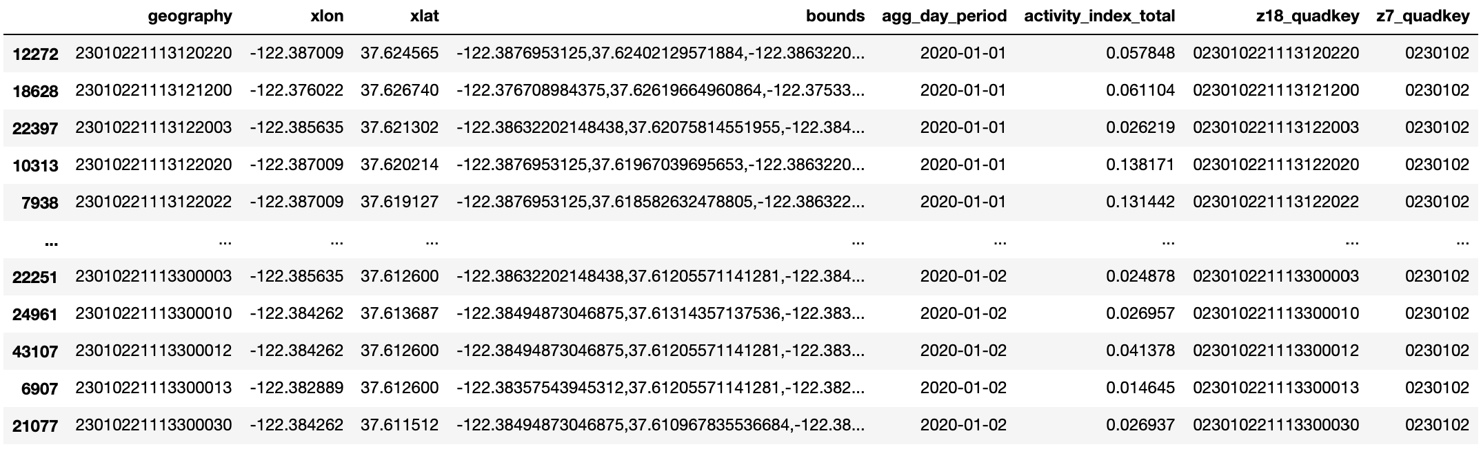
Click on this link to access a sample CSV file consisting of January 1st, 2020 Movement data covering the San Francisco Bay Area.
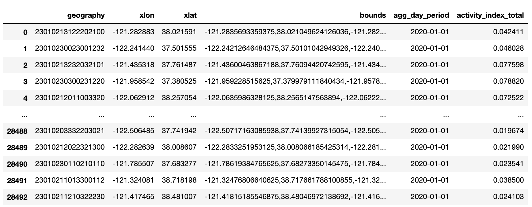
The CSV file is an example of activity index aggregated by day, by quadkey:
- The bounds field provides the outer corner coordinates of each quadkey (roughly the size of a city block), while the xlat and xlon fields show the centroid of each quadkey.
- The agg_day_period field should show 2020-01-01 in this example.
- The most important field is the activity_index_total, which tells us the normalized activity for each city block.
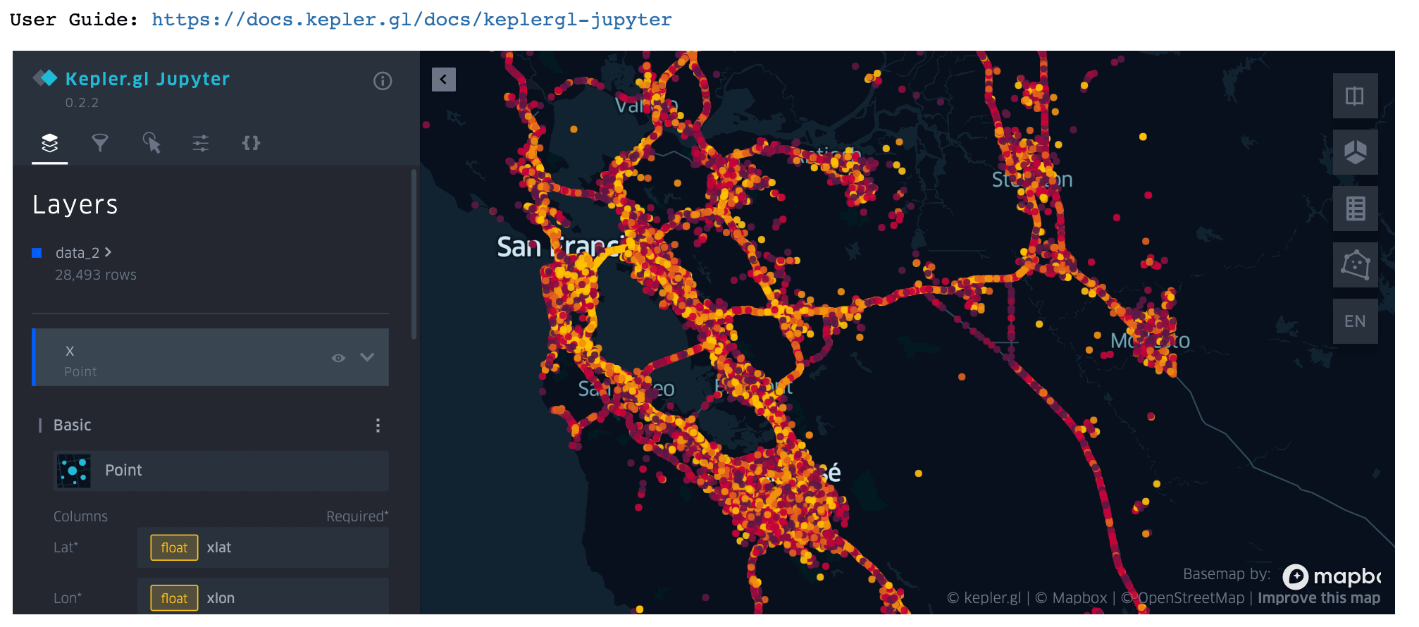
- Each line item in this CSV file has already been converted to latitude and longitude coordinates. All we need to do is drag and drop this CSV file into Kepler.gl to visualize the activity index.
Each point in this map represents a quadkey. We can hover over each point to view its activity level, centroid, and date. We can also zoom in and out of the map to observe micro versus macro activity patterns:
If you would like to access a full year of Mapbox Movement sample data in the US, Germany, and Great Britain, submit a sample request and follow the instructions to download the data. Continue with the tutorial to learn how to download Movement data and analyze activity at specific geographic locations.
GETTING SET UP
- Have access to Mapbox Movement sample dataset (Request access to the Movement sample dataset for free).
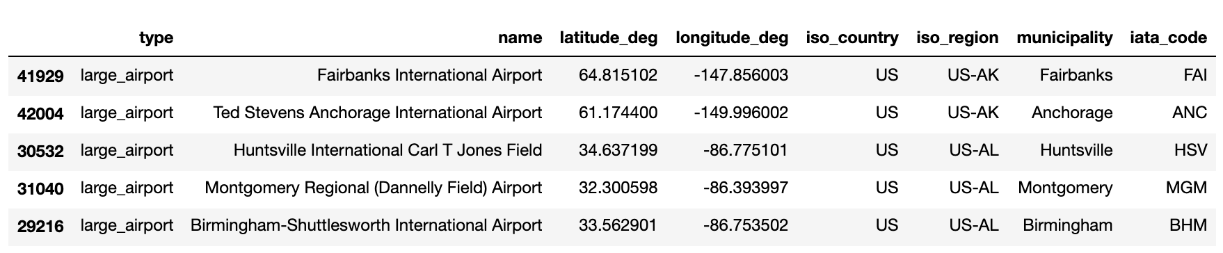
- Download the file named airports.csv from OurAirports’ latest Airports dataset. We will be using the following attributes from this dataset: type, name, latitude_deg, longitude_deg, iso_country, iso_region, municipality, iata_code.
- Have the following list of python dependencies installed in your virtual environment. My virtual environment and Jupyter notebook are running on Python 3.7.2.
- Jupyter (I am using the classic Jupyter Notebook in this tutorial)
- Requests
- Matplotlib
- Pyproj
- Pandas
- Shapely
- Mercantile
- keplergl—for visualizing geolocation data in the classic Jupyter Notebook. *Some may experience issues with GDAL. If that is the case, try installing GDAL manually.
- (Optional) GeoPandas
- (Optional) Download the Jupyter notebook from GitHub or AWS S3 to follow along. Note that you will need to have valid AWS credentials set before starting the notebook server. These AWS credentials should be set in the same terminal window as the terminal window you are running the Jupyter notebook in.
VISUALIZING MOVEMENT DATA IN A JUPYTER NOTEBOOK
Besides visualizing Mapbox Movement data in the web-based version of Kepler.gl, we can also load the sample CSV file consisting of January 1st, 2020 San Francisco Bay Area Movement data in a Jupyter notebook. Make sure you have the Jupyter version of kepler.gl installed in your virtual environment. You can use the following function download_csv_to_df.() to download the sample CSV file to the same directory as the Jupyter notebook:
Paste the following commands into a Jupyter notebook cell, hit Run, and watch the Movement data get loaded into a kepler.gl map like the one you see below. You will see further down in the tutorial that this is a handy tool to use when we’re drawing and visualizing boundaries around each airport.
If you are using JupyterLab instead of the classic Jupyter notebook, you may run into issues with loading the kepler.gl widget. The workaround is to save the map as an interactive HTML file with the .save_to_html() method. You can then interact with this HTML file in your favorite web browser.
AIRPORT ACTIVITY ANALYSIS
Let's begin by finding the geolocation of the airports we want to study. First, use the previously defined function download_csv_to_df() to download the file airports.csv from the latest dataset by OurAirports and convert the data into a Pandas DataFrame:
We will then drop all unnecessary columns and filter the DataFrame to only include major US airports:
Here are the first five rows of this DataFrame:
In order to aggregate and analyze the activity associated with each airport, we will need to define the boundaries for each airport. There are close to 25,000 airports based in the US in this airport dataset. 170 of them are categorized as “large airports”. We can manually draw the boundaries for each, but this will be time-consuming. A more efficient way is to make use of the geospatial libraries like Shapely and Mercantile to help us draw approximate boundaries at scale.
Let’s first convert each airport’s latitude and longitude pair into a Shapely Point object, which represents a single point in space:
Next, we will create a circle with a radius 1,000 meters around each airport’s Shapely Point object via Shapely’s buffer() method. This circle will serve as our “approximate boundary” for every airport. It is stored as a Shapely Polygon object. Because we will be calculating circles on the surface of the Earth, this process involves a bit of projection magic. For more information about why we need to transform the coordinates back and forth between AEQD projection and WGS84, please see section I in the Appendix.
Repeat this step for all airports by applying the aeqd_reproj_buffer.() function above to all rows in the us_airports_df_large DataFrame:
We can then use kepler.gl to visually inspect the center coordinates and 1 km circle around any airport.
For example, run the following code snippet to visualize the area around San Francisco International Airport (SFO):
kepler.gl provides a set of Mapbox basemap styles and allows us to easily change the background map. Open the Base Map Panel and try different background map styles from a list of default map styles. Here I've selected Mapbox Satellite:
Mapbox Movement quadkey data are aggregated at zoom 18, which is roughly the size of a city block (approximately 100 meter resolution). You can use What the Tile interactive tool to visualize quadkey tiles of various sizes. For example, here are some of the zoom 18 quadkeys that overlap with the 1 km circle we drew at San Francisco International Airport (SFO):

The zoom 18 activity data are stored in CSV files, with each file containing data for a single zoom 7 tile. We can use What The Tile to look up the zoom 7 quadkey number for the area containing SFO airport—in this case, the zoom 7 number is 0230102 (Incidentally, the zoom 7 number is just the first 7 digits of any zoom 18 numbers that cover the airport). The zoom 7 tile covers a much larger region of the San Francisco Bay Area:

The January 1st daily activity data for the zoom 7 tile containing SFO and the rest of the Bay Area is stored under the following path in AWS S3: s3://mapbox-movement-public-sample-dataset/v0.2/daily-24h/v2.0/US/quadkey/total/2020/01/01/data/0230102.csv.
A more efficient way is to use the generate_quadkeys.() method below to find all quadkey tiles that lie within 1 km radius of each airport for a given zoom level. When we input the circle Shapely Polygon object we created for SFO and 7 as the zoom, the function returns the zoom 7 quadkey 0230102. When we input the circle Shapely Polygon object we created for SFO and 18 as the zoom, the function returns the full list of zoom 18 quadkeys as the ones you saw earlier from What The Tile. Note that some airports' polygons span more than a single z7 quadkey.
We can use this method to quickly generate zoom 18 and zoom 7 quadkeys for all airports. Recall that we've generated 1 km circle polygons for each airport and stored them in the aeqd_reproj_circle column of the us_airports_df_large DataFrame.
Once we have these zoom 18 and zoom 7 quadkeys, we are now ready to download some activity data from the Mapbox Movement sample dataset. The download_sample_data_to_df() function below lets us download the raw activity data and create a Pandas DataFrame spanning all dates between a given start and end date.
We can pass in multiple zoom 7 quadkeys from a single airport or zoom 7 quadkeys from multiple airports. Take San Francisco International (SFO) and Denver International (DEN) for example, we can download all activity data from January 1, 2020 to January 2, 2020:
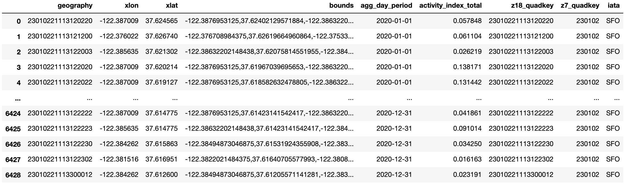
This Mapbox Movement data set is aggregated by day, where the dates are specified under the column named agg_day_period. There is a single activity index value (column named activity_index_total) per date per zoom18 quadkey (column named z18_quadkey). Let’s first filter the DataFrame, so that it only includes data from all the regions containing SFO's 1 km circle polygon.
Note that there is a lot more zoom 18 quadkey data in this initial DataFrame for SFO than we need. Not all of these zoom 18 quadkeys overlap with our 1 km circle centered at SFO. This is why it is important for us to filter this DataFrame and remove unneeded zoom 18 quadkey entries in the following step:
We now have a DataFrame that only include entries of relevant zoom 18 quadkeys that overlap with SFO's 1 km circle over the course of two days in January, 2020:
Compared to the two day example we just saw, downloading and filtering a full year's worth of data takes longer to run. In the interest of saving time, we've pre-processed the download step of 2020-01-01 to 2020-12-31 activity data for four airports—Dallas/Fort Worth International Airport (DFW), Denver International (DEN), Dulles International Airport (IAD), and San Francisco International (SFO). This data has been compressed and uploaded as zip files to the public Mapbox Movement sample data bucket on AWS S3. In section III of the Appendix, we will show you how to access these zip files and how these larger zoom 7 quadkey DataFrames can be useful in our deep dive analysis.
We've also pre-processed the filtering step and uploaded activity data from all relevant zoom 18 quadkeys that overlap with each of the four airport's 1 km circles to the same S3 bucket. We can use the previously defined function download_csv_to_df() to download this data. Continue to use SFO as an example,
We also want to get the IATA airport code from our original US large airport DataFrame, so that we can distinguish one airport from another when we’re doing the comparisons later. Finally, we will sort the DataFrame by date.
This is what the resulting DataFrame looks like:
We can repeat this step for the remaining three airports—Dallas/Fort Worth International Airport (DFW), Denver International (DEN), and Dulles International Airport (IAD). You can find more detailed code in the Jupyter notebook, available on GitHub and AWS S3.
Next, we want to generate some interesting statistics for each airport.
I. AGGREGATE THE DAILY ACTIVITY INDEX FOR ALL Z18 QUADKEYS OVERLAPPING THE TARGET AIRPORT
The following code snippet calculates the aggregated activity per day for SFO:
Repeat this step for all three other airports, plot and compare the daily sum of activity indices of all four airports. The script that generates the chart below can be found in the Jupyter notebook.

From the chart above, we can see that DFW generally has the highest levels of activity of the four airports, with DEN coming in second. Although the activity in all airports has decreased after the start of the pandemic, this pattern holds throughout the year.
This analysis comes with caveats. Recall that we estimated the area of each airport to be a circle with a radius of 1 km around a centroid point. This may not be entirely accurate. For example, some airports may be larger than others, and the centroid we used may be closer to the terminals in some airports. There may even be more subtle differences between airports. For example, people may move more across some airports because the terminals are farther from the baggage claims. To properly compare absolute activity levels, we would need to define the area of each airport more precisely (more on that below), as well as potentially take other features of the airports' activity into consideration.
II. COMPARE POST-PANDEMIC CHANGES IN ACTIVITY BETWEEN AIRPORTS
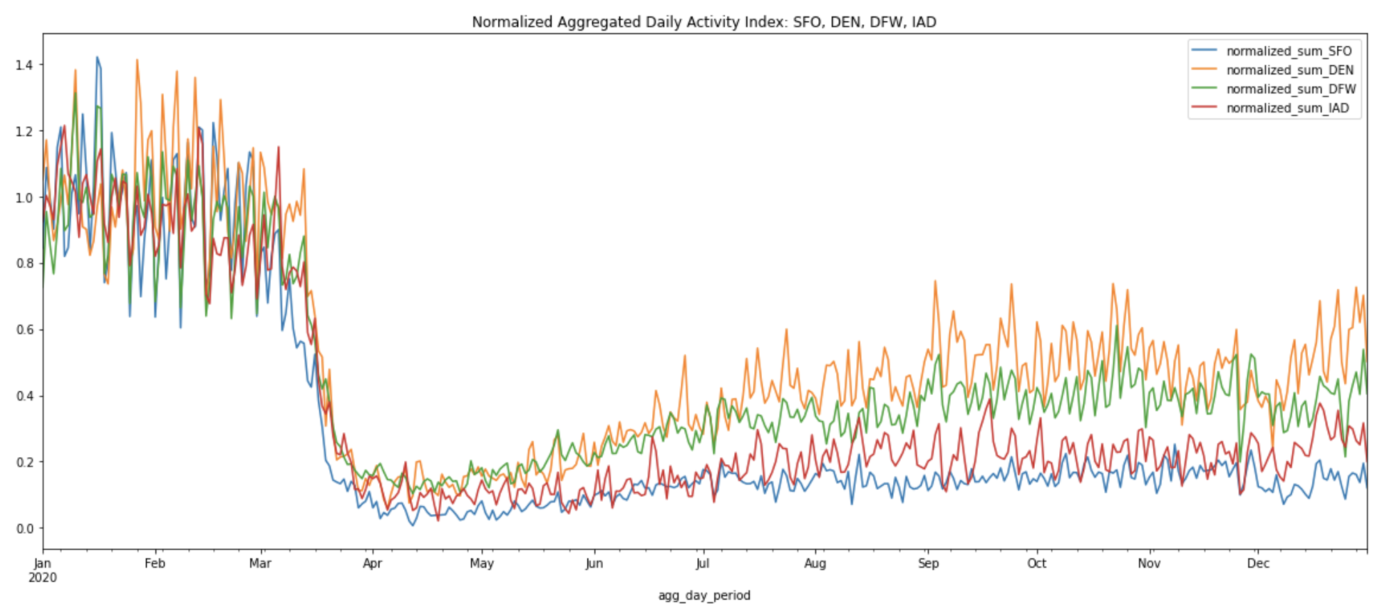
Instead of comparing absolute activity totals, it may be more informative to compare the changes in activity patterns between airports over time. To do so, we can normalize the activity in all airports over the same month of January 2020 (we exclude January 1 to January 3, because there’s usually atypical activity patterns around the New Years). We can then visualize the way the time series of activity at different airports diverge from this starting value.
This analysis is useful to understand, for example, whether activity fell at some airports more than others after the start of the pandemic, and whether it bounced back more in some airports. This type of analysis is also more resilient against the issues described above—as long as we assume that the airports themselves haven't changed, we don't need to have a precise definition of each airport's area or an understanding of its structure to compare the directionality of activity changes between airports.
The normalized activity index curves below allow us to compare the activity index at the peak of the pandemic shutdowns on April 12, 2020 to the summer and winter months across all four airports:
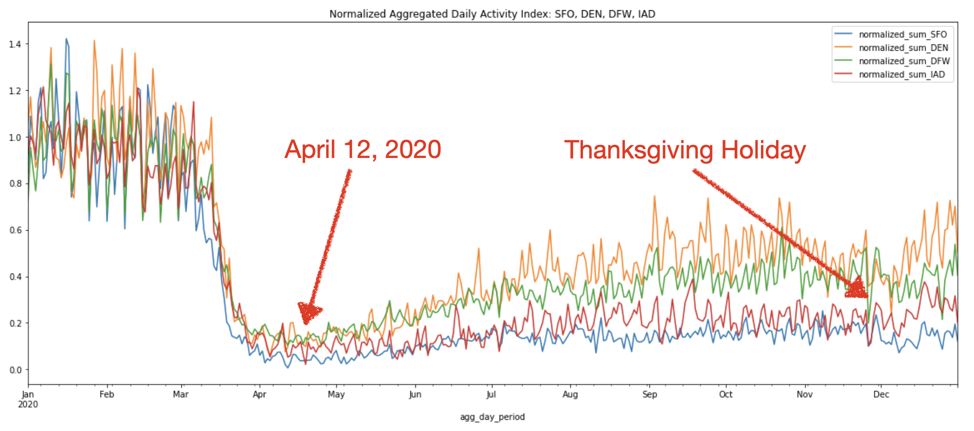
We can see that in general, all four airports show similar activity trends throughout the year. The above chart confirms the sharp decline in air travel starting from mid-March to April due to the travel restriction.
And that’s it! We have now replicated the retail recovery analysis with airports instead of supermarkets. This same methodology can be used to analyze any number of industries and problem spaces. If the above chart looks too noisy due to day-to-day fluctuations, we may want to consider computing a rolling average, to smooth out the graphs and more easily visualize macro trends. This takes us to compute the next statistic.
III. COMPUTE THE 7-DAY ROLLING AVERAGE OF ALL Z18 QUADKEYS OVERLAPPING THE TARGET AIRPORT
This produces a smooth curve that evens out the spikes and fluctuations we observe in the aggregated daily sum of activity indices for each airport.
Plot the 7-day rolling average activity indices for all four airports:

Interestingly, but as expected, the loss of activity for Thanksgiving gets absorbed by the rolling average, so it’s important to choose the right visualization depending on the use case and the insights you are presenting.
We can also create a 7-day rolling average for the normalized aggregated daily sum of activity indices from Chart 2 above to smooth out the spikes and fluctuations.
Plot the 7-day rolling average of normalized aggregated daily sum of activity indices for all four airports:
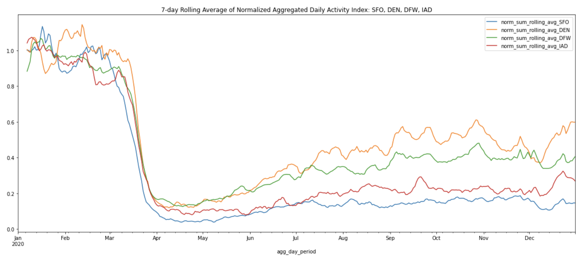
The 7-day rolling averages help us more easily observe the macro changes from the peak of the pandemic shutdowns on April 12, 2020 to the summer and winter months across all four airports. After normalization, we can see that DEN now ranks first in activity level, with DFW coming in second. It’s also easy to spot the increase in activity levels at DEN and DFW during the re-opening phase over the summer months, reaching approximately half the activity levels of the pre-pandemic months.
Of course, our analysis need not be limited by a simple rolling average.We can also apply other time series analysis methods to smooth out the series; for example, we might want to normalize by variation across days of the week, or analyze weekday and weekend traffic separately. See section II in the Appendix for additional information.
BUT WAIT! AREN'T THESE AIRPORTS MUCH LARGER THAN THE 1 KM CIRCLES?
Now, let’s address the elephant in the room–the fact that we drew circles with 1 km radius around each airport regardless of size and passenger traffic. According to the FAA, SFO occupies 5,207 acres (21.07 sq. km), while DEN covers 33,531 acres (52.4 sq mi; 135.7 sq. km). In terms of passenger traffic, Denver International Airport (DEN) saw a record-setting 64.5 million passengers in 2018, whereas SFO saw more than 57.7 million travelers in the same year. Drawing same sized circles was a convenient first step for us to quickly define areas around each airport, but how much of the airports’ true activity patterns were we able to capture?
The quick answer is that it doesn’t matter too much in terms of relative activity, because the normalized daily aggregated activity trends tend to be quite stable. The chart below shows the normalized aggregated daily activity within the precisely drawn boundaries of Denver International Airport (DEN) against various circle sizes and locations.
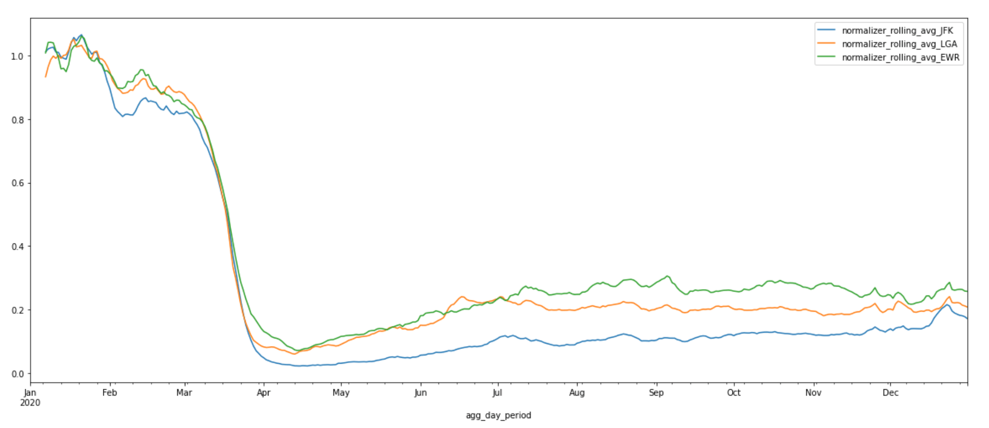
MORE AIRPORTS: JFK, LGA, EWR
With the methods described above, we can expand to any airport of interest. The chart below shows the 7-day rolling average of normalized aggregated daily activity of three new airports—John F Kennedy International Airport (JFK), LaGuardia Airport (LGA), and Newark Liberty International Airport (EWR). These three airports are located within close proximity of each other. Activity in all three airports follows a similar decreasing pattern after the start of the pandemic as the one we saw for the previous four airports. We can see that activity levels at Newark Liberty International Airport and LaGuardia Airport exhibit upward trends during the re-opening phase during the summer months while activity at John F Kennedy International Airport remains relatively low. This is particularly interesting because JFK airport is directly connected to the subway and has the most domestic and international flights and time options of the three airports. For many New Yorkers, JFK airport is their go-to. The suppressed activity levels we see at JFK may be attributed to the unprecedented decline in international travel due to the travel ban.
CONCLUSION—AND MORE POSSIBILITIES
In this blog post, we’ve explored the tools and methodologies for accessing and getting the most use out of Mapbox Movement data. We also did a deep dive into how reliable the normalized daily aggregated activity index of a small area (1 km circle) is in representing the overall movement patterns of an entire airport. This means that with the tools and datasets introduced in this post, we can observe the macro patterns and draw interesting insights to better understand the most severely impacted industry by the pandemic. Here are a few other interesting ideas to explore related to the airport dataset:
- Compare activity trends for small and medium-sized airports against large airports in the US. We may find some interesting spatial and temporal trends in these smaller sized airports around Thanksgiving 2020.
- Compare activity trends for airports in other countries around the world against US airports. Mapbox Movement has coverage globally.
These same tools and methodologies can also be applied to any other geographic locations such as retail locations, parks, beaches etc. If you’re interested in trying out this tutorial and/or getting your own mobility insights, make sure to check out the Mapbox Movement Data page to download the data, grab the Jupyter notebook off GitHub or AWS S3, and get started today!
APPENDIX
I. PROJECTION SYSTEMS
Projections are mathematical transformations that take spherical coordinates (latitude and longitude) and transform them to an XY (planar) coordinate system. However, since we are transforming a coordinate system used on a curved surface to one used on a flat surface, there’s no perfect way to convert one to the other without some distortion. Some projection systems preserve shape and area, while others preserve distance and direction. Therefore, deciding on the projection system is a nontrivial task. A commonly used default is Universal Transverse Mercator (UTM), which divides the Earth into 60 predefined zones that are 6 degrees wide. Within these zones the UTM projection has very little distortion. However, the farther away from the center of the UTM zone, the greater the distortion on area and distances. In this example, we are performing distance calculations on airports across the entire US. The azimuthal equidistant projection (AEQD) is a more appropriate projection system to use. It has useful properties in that all points on the map are at proportionally correct distances from the center point, and that all points on the map are at the correct direction from the center point.
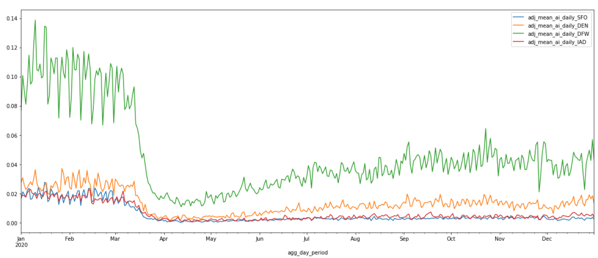
II. COMPUTE THE ADJUSTED DAILY AVERAGE ACTIVITY INDEX FOR ALL Z18 QUADKEYS
During our earlier introduction to the Mapbox Movement product, we mentioned that the activity index is calculated by aggregating anonymized location data from mobile devices. This anonymization process is implemented to protect Mapbox users and is applied on a daily basis. During this process, a small random noise is intentionally applied to total activity counts. Geographic areas with counts below a minimum threshold are dropped. This means that certain zoom 18 quadkeys may not have enough activity counts to make it past our privacy thresholds on a given day. These quadkeys will not be included in the dataset on that given day.
Because of this, we need to pay special attention when computing medians or averages. Simply applying the built-in mean() and median() methods to activity count could lead to inaccurate results because the denominator, which is based on the number of quadkeys that do have enough activity counts, will also fluctuate on a daily basis. Instead, the correct way of computing daily average would be to average across the total number of all Z18 quadkeys that overlap with the circle with 1 km radius. This is the correct denominator to use as it also takes into account the Z18 quadkeys that did not make it past our privacy thresholds on a given day. Take San Francisco International (SFO) for example,
Plot the adjusted daily average activity indices of all four airports:
III. DEEP DIVE INTO APPROXIMATE VS. PRECISE AIRPORT BOUNDARIES
This section explores how the daily aggregated activity index and normalized curve fluctuate depending how we define an airport’s boundaries. Can we trust the normalized daily aggregated activity index of a small area (1 km circle) adequately captures the overall movement patterns of an entire airport? We will compare the statistics of various boundary sizes including one derived from the precisely drawn boundaries of an airport.
Similar to what we did in the original airport analysis, we will need to first draw new boundaries. We can no longer use the filtered DataFrames, e.g. the z18_sample_data_sfo_df, because these DataFrames consist only of data from zoom 18 quadkeys that overlap with each respective airport’s original 1 km circle polygon. We will need activity data from a larger set of zoom 18 quadkeys. Recall that we've compressed 2020-01-01 to 2020-12-31 activity data for four airports—Dallas/Fort Worth International Airport (DFW), Denver International (DEN), Dulles International Airport (IAD). Each of these zip files consists of activity data from all zoom 18 quakeys within a single zoom 7 quadkey.
The function download_zipped_z7_sample_data_to_df.() in section III of the Appendix lets us download the zip file of a given airport and create a Pandas DataFrame to hold its Movement sample data. We will use Denver International Airport (DEN) as an example throughout this section. First download DEN’s 2020 Movement sample data:
We also need a method that helps us generate a suit of new circle Polygon objects based on two factors—how much we want to shift the original center coordinates by and how large we want to make the circles. The function generate_new_circles.() in the Jupyter notebook uniformly shifts the center coordinates by the input range of decimal degrees in four directions—vertical, horizontal, left and right—and creates circle Polygon objects based on the input range of radii around these new center coordinates.
The snippet below produces 27 new circles of various center locations and radii for DEN:
This is what these circles look like on a kepler.gl map:

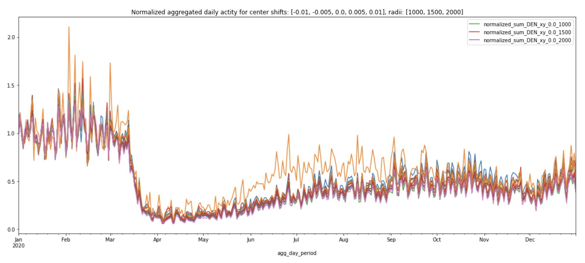
Similar to how we generated statistics for each of the four airports above, we will also repeat the same process for each of these new circles using the generate_daily_stats_circles.() function. Plot these statistics using the plot_daily_stats_curves.() function (you can find more detailed code in the Appendix section of the Jupyter notebook, available on GitHub and AWS S3). Observe how the daily aggregated activity index and normalized daily aggregated activity index change.
We can see that some circles have higher daily aggregated activities than others. The circle that has consistently higher daily aggregated activities than others is the one that’s been shifted 0.01 degrees south from the original center coordinates (-104.672996521, 39.861698150635) and with radii 2000 meters (labeled ‘y_0.01_2000’).
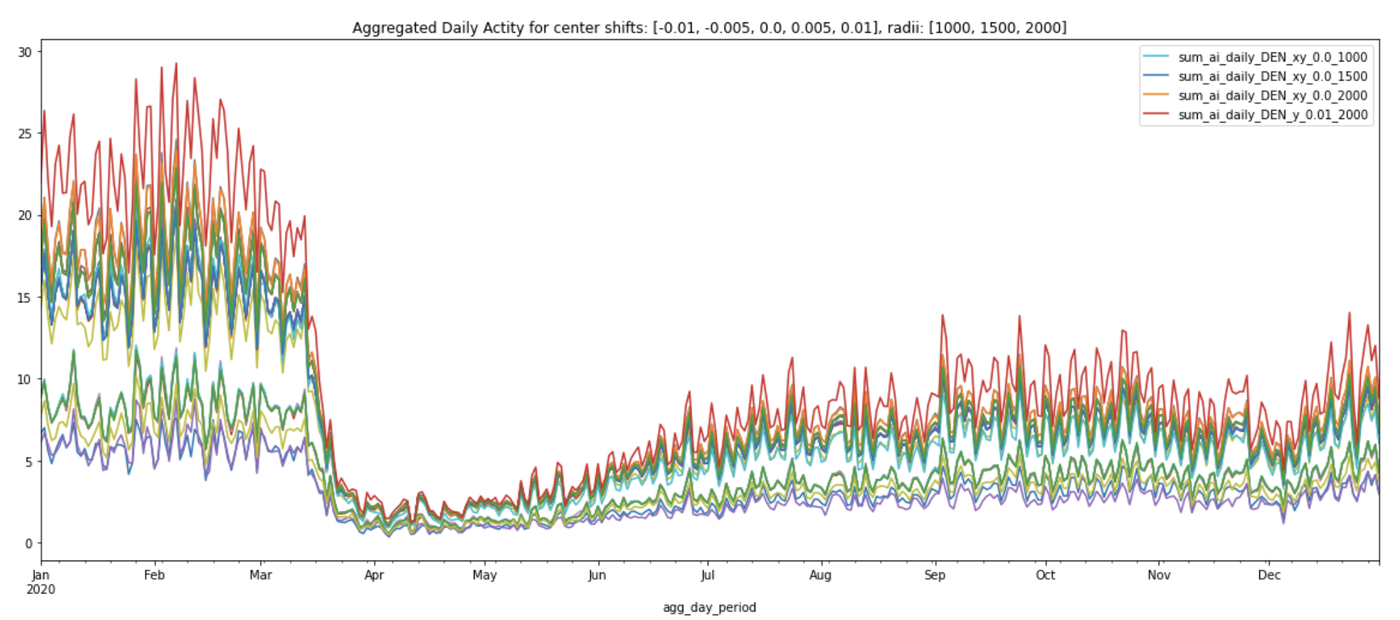
Interestingly, the normalized curves all following a similar pattern regardless of center location or amount of area covered (plot legend shows the normalized curve for the original center coordinates with various radii).
Next, let's draw the precise boundary for DEN and see how its daily aggregated activity and normalized curve differ from the ones produced by various circles:
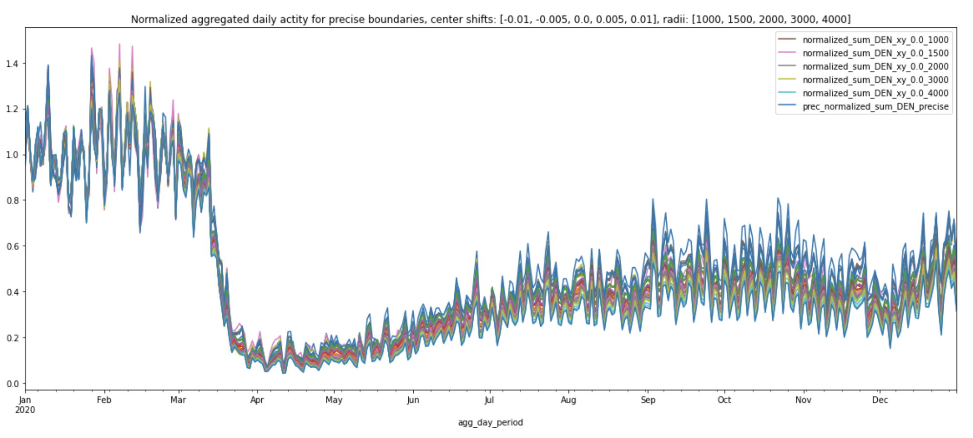
.png)
From March, 2020 to December, 2020, the normalized curve for precise boundary (labeled prec_normalized_sum_DEN_precise in the plot below) consistently has the lowest values, compared to all the other normalized curves produced by various circles. This may be because the precise boundary covers a much larger area of DEN and therefore takes into account the lower traffic volumes near the international terminal. Travel restrictions to and from the majority of European countries went into effect on March 13th, 2020. Even though these normalized curves share similar patterns, we can still see the travel ban’s impact on the overall activity at DEN in the plot below:
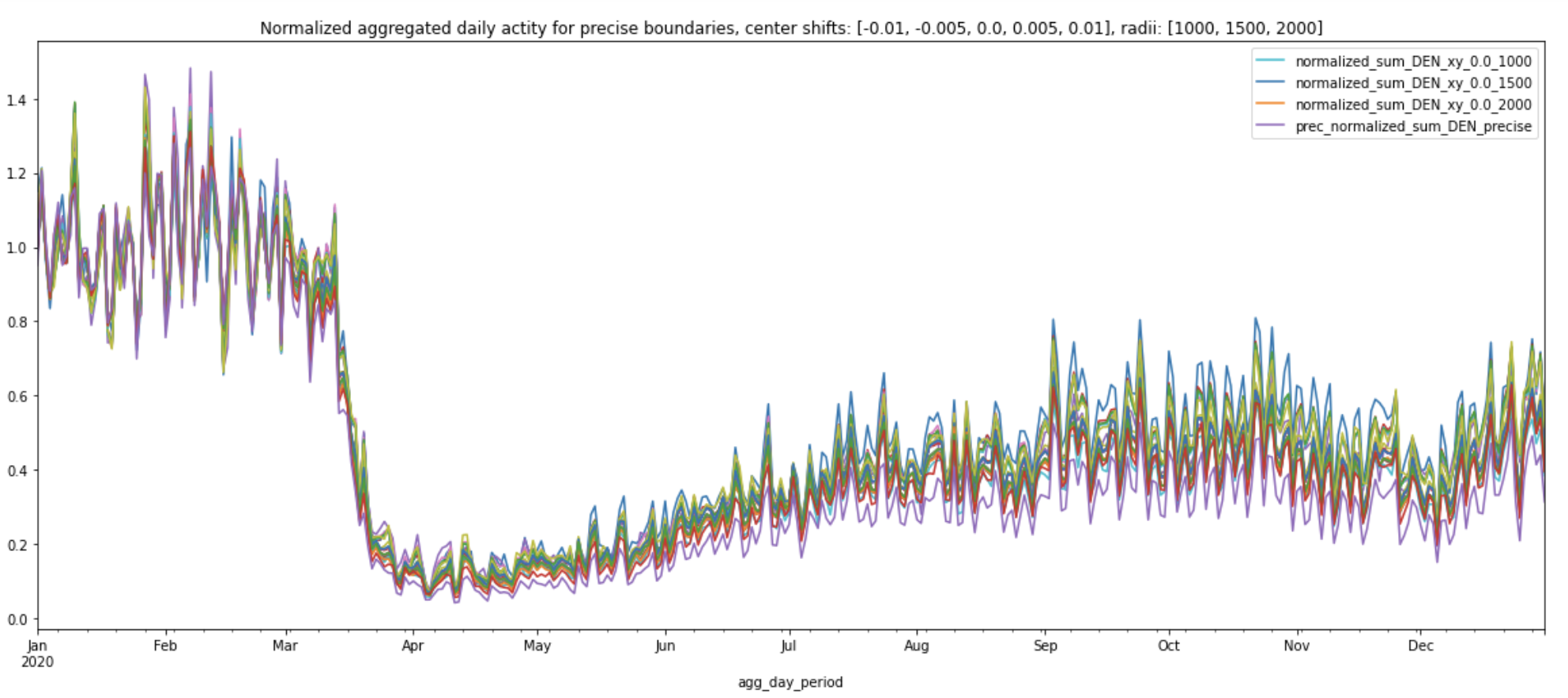
Let’s see what happens when we increase the radii to 4 kilometers:

The normalized daily sum for 4000 meters nearly overlaps with the precise boundary’s normalized daily sum and its pattern matches the normalized curves of other circles.
From these experiments, we can draw two main conclusions:
- We can trust that the overall movement patterns for the airports as a whole are well represented by these normalized daily aggregated activity indices. The various plots above show that even though the magnitude of the daily aggregated activity index might fluctuate, the overall trends in normalized daily aggregated activity index actually does not depend on the specific choice of center coordinates and radius! They are fairly stable.
- As we see in the line charts, there may be some noise in individual activity levels. It’s important to understand that we are looking for macro, consistent patterns in activity levels and should avoid over-intepreting individual data points. For example, the different normalized curves have up to a 0.1 difference in the activity score in October. This means that you probably shouldn’t consider a change of that size to be particularly meaningful in your analysis unless you do a confidence level analysis, or unless you see that the pattern holds pretty cleanly and consistently. Another example of this is the retail analysis we did in the retail recovery blog post. In that blog post, we compared normalized activity indices across more than 5000 retail locations. We can see that Costco’s overall movement patterns looked very different from Macy’s. On the other hand, AMC's index greatly overlapped with Macy’s. This means that the difference between the first pair gives us stronger signals of how people’s activity patterns have changed than the difference between the second pair.


