Back to all cases

Mapbox capabilities help CNN engage audiences with visualizations for breaking news and election coverage
Key benefits of building with Mapbox
- Mapbox Studio lets data journalists control every detail of map visuals and publish news stories quickly.
- The Mapbox Tiling Service processes custom data fast, even during spikes of traffic.
- Mapbox GL JS and the Mobile Maps SDK support optimized, interactive data visualizations at any zoom level.
products used
About CNN
CNN Worldwide is the most honored brand in cable news, reaching more individuals through television, streaming and online than any other cable news organization in the United States. And CNN Digital is the #1 online news destination, with more unique visitors than any other news source. Whether about politics, business, or the weather, CNN has you covered on the most important news of the day.
News about major events, natural disasters, and elections involves communicating a great deal of complex contextual information, which is why CNN uses Mapbox maps to create clear, impactful visualizations of weather stories, disasters, election results, and more.
Reimagining election reporting with interactive maps
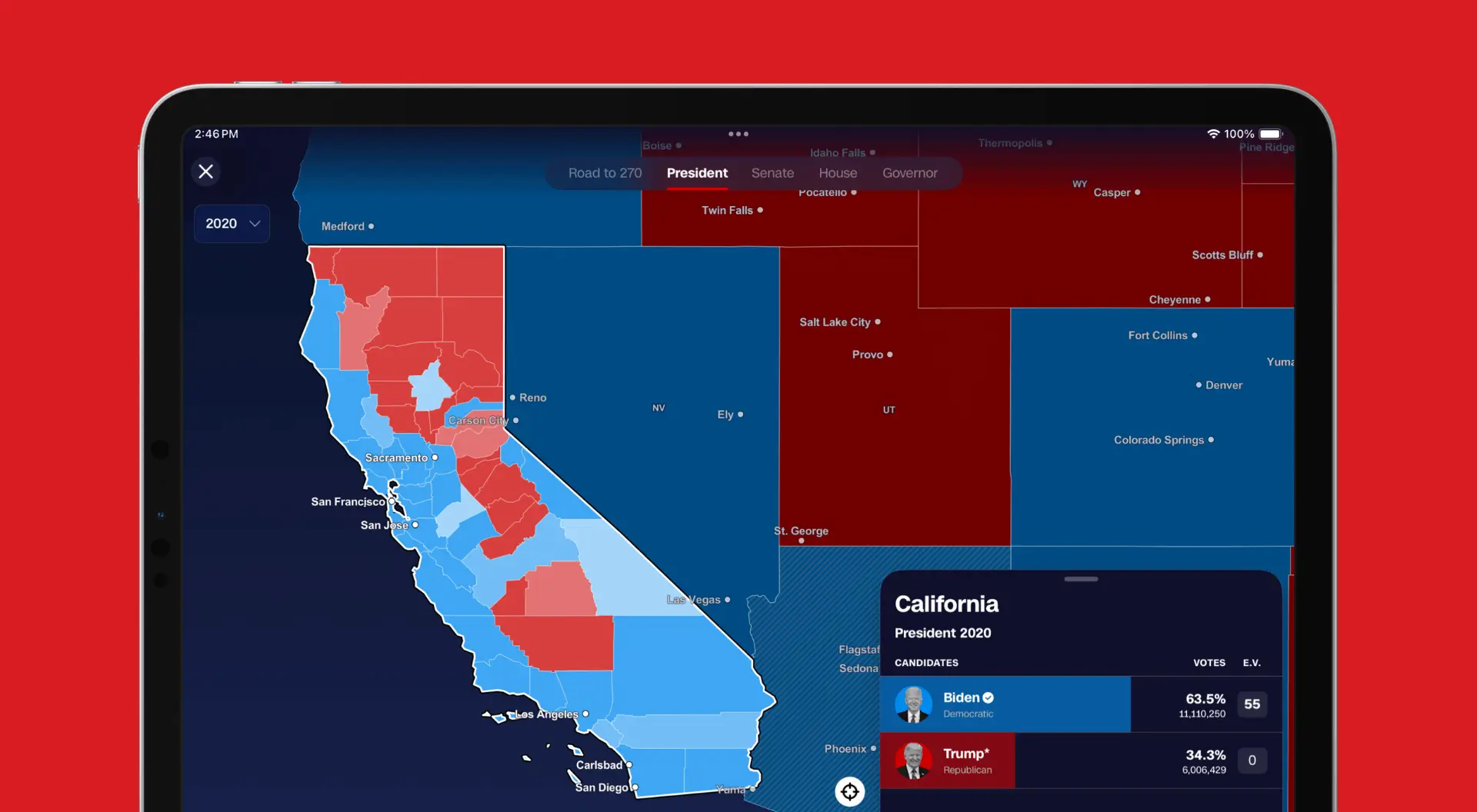
CNN raised the bar for election reporting during the 2024 U.S. election cycle, using dynamic, interactive maps. Powered by the Mapbox Mobile Maps SDK, CNN delivered the iconic Magic Wall experience to millions of CNN app users across the U.S. and around the world.
This feature allowed users to easily zoom into results data, from national to county and district levels, helping them contextualize broad election trends within their local communities. Users could also compare current results with past elections (2016, 2020, and 2022) to explore emerging trends and observe how states and counties have evolved over time.
Mapbox also enables CNN’s web-based experiences, delivering results data for various elections— from presidential and Senate races to House and gubernatorial contests.
CNN chose to collaborate with Mapbox for election maps due to the flexibility and reliability of the Mapbox Maps SDK for mobile applications, including offline functionality. CNN needed an enterprise-grade map provider capable of handling large-scale demand and offering versatile solutions across multiple platforms.
Our goal is always to empower our users. During one of the most important elections in U.S. history, we aimed to help our audience not only follow real-time election results but also understand how their communities have evolved over time. Maps provide a powerful way to present and explore this data, and this year we were able to deliver that experience in collaboration with Mapbox, which provided us with flexible and easy-to-use capabilities.
Manav Tanneeru, Senior Director of Product, CNN

Critical infrastructure for dynamic news stories
The CNN team uses maps extensively when reporting on major weather news or natural disasters. Hurricanes and wildfires move fast, and people rely on CNN to provide clear updates on when and where major weather events are going to occur. Mapbox maps provide a reliable and high-performance canvas to help communicate the what, where, when of natural disasters and other major events. The key differentiator of Mapbox is how quickly the CNN Visual News team can use the Mapbox Tiling Service, Mapbox Studio, and Mapbox GL JS to launch high-power interactive maps.
Every minute counts when we are trying to go live with a news story, which is why we use Mapbox design tools to quickly publish maps to our stories. We’re analyzing data and designing maps every day—from reporting on earthquakes to tracking hurricanes to monitoring wildfires—and Mapbox is key for CNN to deliver those fast maps.
Sean O'Key, Interactive Director, CNN

Full design control for data visualizations
The CNN Visual News team also makes use of Mapbox to produce in-depth data journalism stories. When the 2020 US Census data was released, the team produced a dot-density map examining race and ethnicity in the U.S. within just a few hours of the major release. Not only did the use of Mapbox Studio help to easily design the overall look and feel of the dot-density basemap, it also allowed control over key map features such as water bodies and roads.

Engaging audiences with meaningful maps
Equipped with Mapbox maps, teams across CNN build interactive maps that help audiences dive deeper into news stories that are important to them. Mapbox GL JS and the Mapbox Mobile Maps SDK provide the technical architecture to create modern, user-friendly map experiences that can smoothly handle large spikes in traffic. The Mapbox Tiling Service makes it easy to add custom data layers. And Mapbox Studio helps journalists to build clear and compelling visualizations of the data behind the news. Building with Mapbox means that CNN’s maps are front-page ready, every time.


