Navbar Styles
The main Navbar component "Navbar New" lives at the top of this page. To edit non-dropdown content (i.e. the content you see before interacting with the navbar), edit the "Navbar New" component above.
Below this section, you will see that each dropdown's content has been made into a component. To edit a dropdown's content, you will need to edit those individual components. For the Products Dropdown, there is a component for each individual tab (e.g. "Navigation") as well as an overall "Products" Dropdown.
If you need to update a link, you will need to do it to both desktop and mobile. To edit the mobile Navbar, switch to the tablet breakpoint and the dropdown content can be edited from there. If you need to edit non-dropdown components of the mobile nav, you will need to edit the Navbar New component and toggle the element with the class 'nav_mobile' to display:flex.
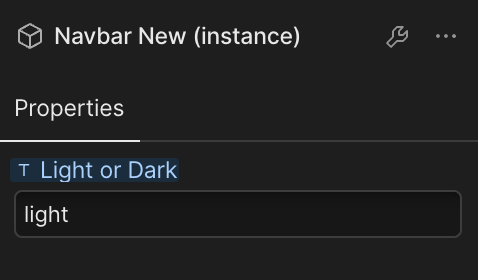
The "Navbar New" component uses variables to switch between light and dark mode. On any instance of the component, you may type "light" or "dark" on the properties panel to change the color (see image to the right). The same applies to the new footer.


