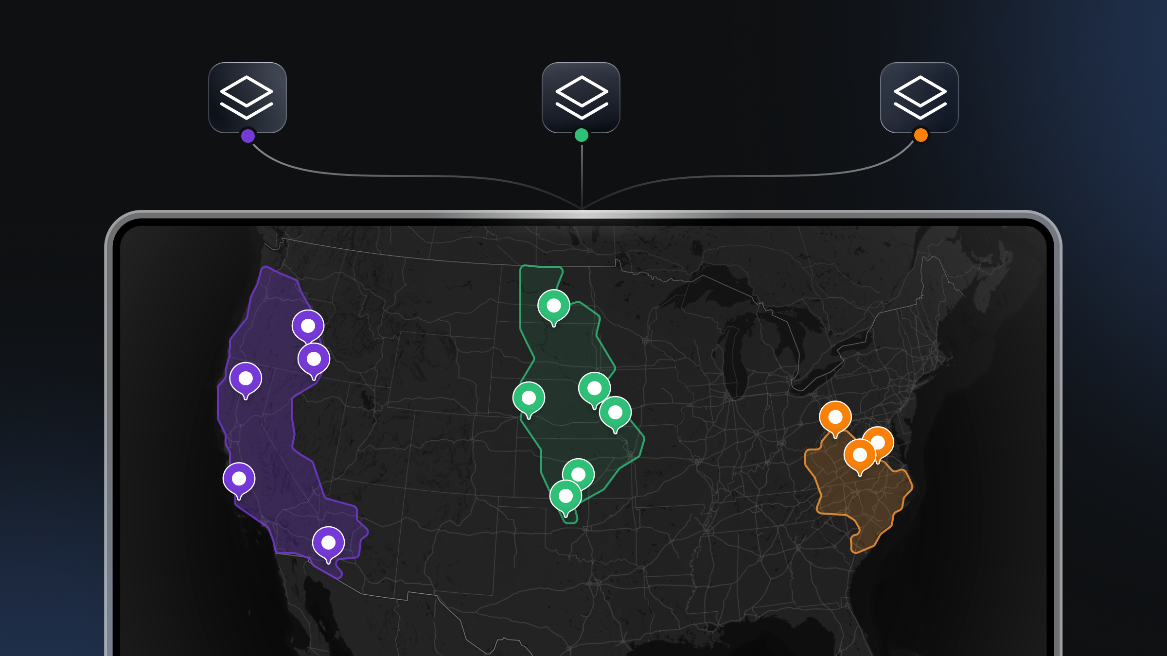
Studio’s new style component designed especially for data visualization

Studio has a new style component built for fast data visualization in private beta for select customers starting today. Style components provide sensible defaults and quick opportunities for customization by optimizing the most common style property changes and packaging them into drop-down options, sliders, and toggles. This new data visualization component is an easy way to create stunning spatial visualizations with custom data on the map, explore different data visualizations, quickly prototype various data stylings, and learn about data visualization types and best practices.

There are two types of data visualizations to start with:
- Choropleths, or shaded areas that represent values in your data, such as population density, election results, or per-capita income.
- Data-driven circles, also known as scaled point maps, bubble maps, or proportional symbol maps, where size represents a value in your data. Often used in public health and political maps.
The Data visualization component can be added to any style using the “add component” menu in the Mapbox Studio Style Editor. Once the component is added to the style, Studio will prompt you to add data, choose a visualization type, and then begin styling the data.
Toggle, slide, and experiment with data styling using the intuitive component controls. Studio has 19 colorblind-friendly palettes available, as well as an option to add labels from a field in your data to set context.


In addition to Choropleth and Data-driven circles, we plan to add several more data visualization types in later releases. Sign up for an invite to our beta to start building with the Data visualization component. Tweet us what you create with #BuiltWithMapbox.


