Winters and record-breaking snowfall create challenges in logistics and transportation across the United States. Mail and packages don’t stop on stormy days, but driving conditions do get more unpredictable. By using data to verify and enhance storm weather traffic ETAs, Mapbox is leading the charge in providing more accurate travel time estimates for commuters and travelers alike. Keep reading to learn more about how Mapbox leverages its expertise in data and technology to improve transportation efficiency in Denver and beyond.

In order to power more accurate ETAs for logistics and everyday drivers during unpredictable weather, the Mapbox Telemetry team conducted an analysis of the effect that storm weather had on traffic in Denver, where billions of vehicle miles were traveled during the winter (estimated 21.7B VMT), and thousands of trips were powered by Mapbox Navigation.
Between November 2018 and April 2019, Mapbox collected about 200M miles of anonymous telemetry used to power Traffic Data. Of the 200M miles, 400K anonymous trips (<.05%, totaling 825K miles) were set aside to benchmark the ground-truth of our traffic products.
With this small subset, we are able to infer very granular traffic dynamics in the city — from heavy-traffic rush hour, Friday nights out, and lazy Sundays. We further singled out moments throughout the winter when traffic was exceptionally slow to evaluate the predictive ability of our traffic models under two dimensions of quality: accuracy and symmetry. ETAs during storm days were consistently optimistic and more inaccurate than on typical days. Predictions based on live-traffic data showed a marked improvement over typical-data only ETAs during storm days. This analysis shows the powerful insights that can be derived from a small portion of our telemetry data and the value of the signal that can be extracted by our traffic models.
Here’s a look into how we did it.
Understanding traffic dynamics from anonymous telemetry data
To measure general traffic dynamics in Denver, we calculated the pace (minutes it takes to drive a mile) of each of the trips set aside for evaluation. When we aggregated all those trips, we were able to visualize the variation of pace at which vehicles move hourly through a typical week. It’s worth noting the regularity of traffic: rush hours during the weekdays (high pace) and faster speeds (low pace) during off-peak times. Other details are also visible during typical weeks; for example, weekend nights are more congested than business days, and traffic on Sundays is in general lighter.

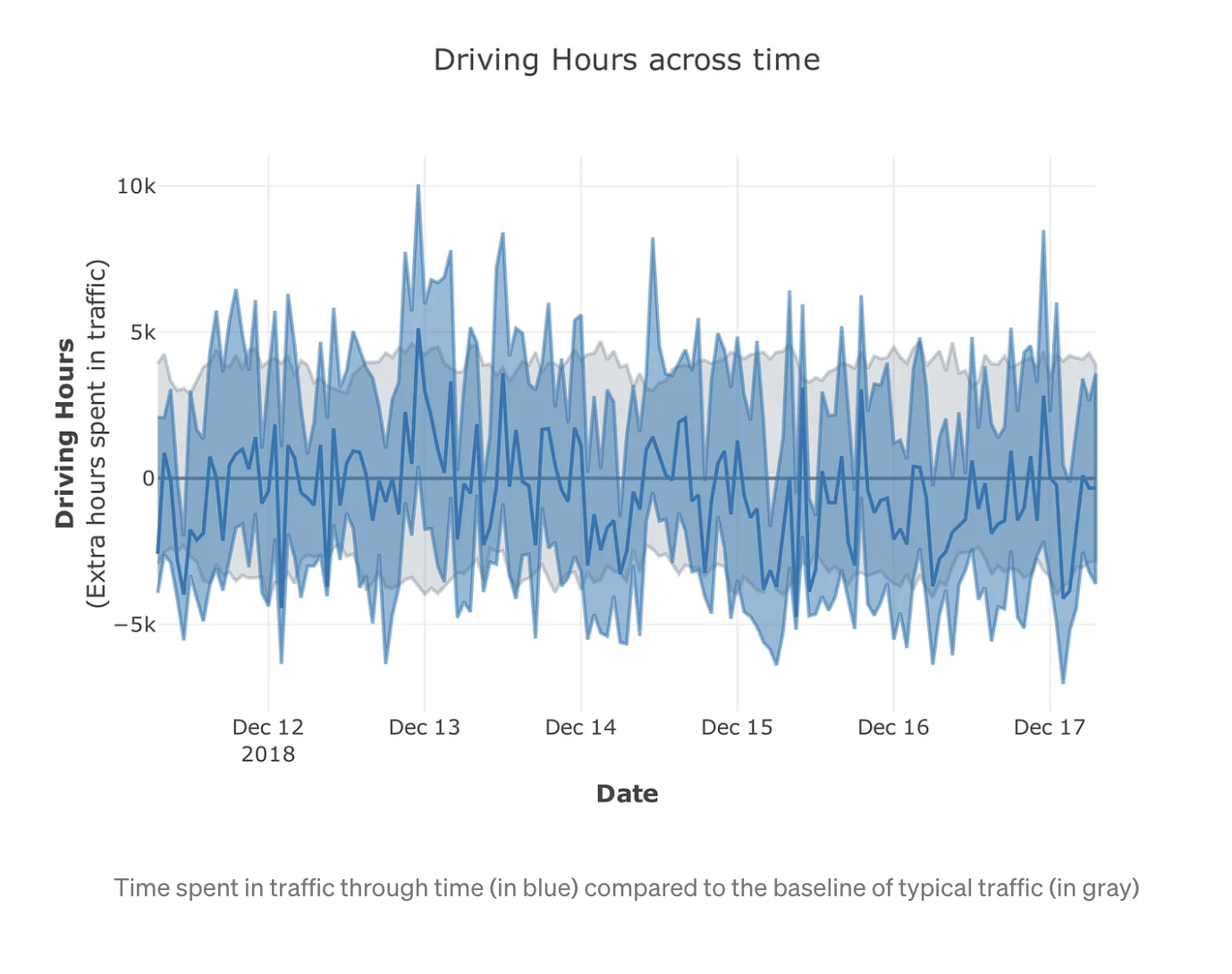
Assuming a constant VMT (vehicle miles traveled), we translated pace into “number of hours” estimating how much any given time during the winter (in blue in the graph below) deviated from the typical baseline we established (in gray). Positive numbers (in the y-axis) are the number of extra hours in which Denverites were collectively stuck in traffic with respect to the same time in a typical week, while negative numbers are exceptionally low traffic periods. For example, in the second week of December, traffic fell within the baseline and was never particularly fast or slow.
What happens when it snows
On March 13, 2019 a record-breaking storm hit most of the Central US causing major disruptions in Colorado. In Denver in particular, traffic was chaotic and our telemetry data captured a significant slowdown in travel speeds.

For both March 13th and 14th, the extra hours driven were well above the typical week. Road conditions were so bad, that on average each person spent 30 minutes longer in traffic than usual (minutes lost per capita) on March 14th. However, this was not the only storm or irregular traffic pattern in the winter.

We repeated the exercise above for every day from November to April calculating the time per capita “lost” in traffic compared to normal conditions. For a typical day, the minutes delayed per capita were ± 5, however, for most days when a storm was reported (and for some holidays) traffic was exceptionally bad. An example being the Wednesday before Thanksgiving, where on average 11 minutes were lost per capita, and most winter storms added between 10 and 15 minutes per person.
Mapbox Traffic
Throughout the winter, Mapbox powered the navigation of thousands of trips in Denver through our Navigation SDK and Logistics services. ETAs for those trips are calculated using traffic data created through two different processes: (1) typical data, which uses historical telemetry, and (2) live data, which is created using only data from current telemetry. Because traffic is highly cyclical, typical speed data maximizes the coverage of robust traffic estimates, while live data allows us to navigate in real-time through unexpected conditions.
Turn-by-turn navigation from Mapbox uses a combination of those two sources of traffic data, however, some products like the Directions API and Matrix API rely only on typical data. In such cases, atypical conditions as those described above reduce the predictive ability of our models. To understand their impact, let’s breakdown the ways in which we measure traffic quality on the Telemetry team.
ETA Quality and Fan Diagrams
To make sure we understand the strengths and weaknesses of our ETAs, we continually benchmark traffic predictions against ground truth. We collect about one million records daily, for which we calculate multiple versions of error with respect to actual travel times.
One such metric is MSE, which for each observation takes a value between -1 and 1. MSEs value for a record is 0 when there is a perfect match to actual travel times. Negative values represent records in which the ETAs were smaller than the ATAs, therefore we had an optimistic estimate. Positive numbers indicate that we estimated a trip to take longer than it actually did.
MSE = {eta-ata}/{max(eta, ata)}
When thousands of records are gathered and grouped together, we can analyze the trend of a population. These groupings can be geographical (e.g. European countries, APAC cities, US States), temporal (e.g. calendar days, business days vs. weekends), any relevant classification (slow vs. fast trips, types of roads, etc) or even competing models or ETA providers.
Below are histograms of the MSE for groups A through D. Notice that there is a difference in (1) the spread of the distribution and (2) how centered around 0 the error is (symmetry).

To capture both those dimensions, we can we summarize the above distributions in a fan-like graph, in which the x-axis is the mean error (which captures symmetry), while in the y-axis we plot the mean absolute value of the error (which is the overall error, regardless of its direction). Then we measure traffic quality in two dimensions given the location of a distribution in a polar plot: the magnitude (r) and the angle (θ).

The magnitude of the vector between the origin and each point (`r`) is related to the overall traffic accuracy — the further from the origin the lower our quality. For example, `A` and `B` in the figure below have similar overall accuracy, whereas `C` is better. The second dimension is the angle of the vector with respect to the dashed line (`θ`). Clockwise estimates are overall optimistic, and counterclockwise ETAs are too high (overly pessimistic). For example `A` and `D` have the same symmetry value (though `A` has greater accuracy), and while ETAs in `C` were overall the closest to the ground truth, the estimates were off and were almost exclusively too slow.
In summary — the closer a point is to the tip of the graph, the more accurate our estimates are; and the closer to the line in the center, the more balanced optimistic vs. pessimistic trips are.
Traffic Quality on Snowy days
Mapbox traffic data in Denver is generally very accurate. For more detail on how consistent our ETAs were, we can plot our evaluations grouped by day. In the figure below, each point represents the quality of the typical-only traffic estimates on a given day. Similar to the figures above, blue points represent days with significant levels of snow, and red ones holidays. “Normal” days (in gray) form a cloud in the high-quality and slightly pessimistic area of the cone, additionally some holidays (which we don’t treat as regular weekdays) have high predictive ability. During storms, as well as days surrounding holidays (e.g. Wednesday before Thanksgiving), ETAs based on typical data are less accurate and very optimistic. In other words, for these days our prediction is based on baseline business-as-usual ETAs, while travel times on the road were exceptionally long.

Effect of live traffic
Mapbox Navigation is also powered by live-data traffic, which is especially relevant during atypical days. Anecdotally, we have noticed that the contribution of live-data seems to be most beneficial during extreme conditions, but we also want to understand its impact on ETAs on regular days. For storm days and holidays, with atypical traffic, this seems to be confirmed when plotting the error side-by-side in a fan diagram (small markers below are the errors of typical-only ETAs, and larger are ETAs powered by typical+live data).

While our turn-by-turn ETAs during storm days were still too optimistic, the magnitude of the error was much lower–putting our estimates significantly closer to what drivers were experiencing on the road. The live-data also improved the overall quality every day, but the improvement was more visible in extreme conditions. To assess the overall contribution of live-data, we quantified the improvement of the typical+live estimates vs. typical-only in the same dimensions described above.
In the figure below, the x-axis is the difference in the magnitude of the angle θ regardless of its direction, thus positive numbers mean that errors of typical+live are more symmetrical than those of typical only. The y-axis shows the difference in r for the overall error. The vast majority of days fall in the positive-positive quadrant, meaning that live-data improves both the accuracy and symmetry of our ETAs, and this happens for all days, not only those with irregular traffic.

Winter is coming (at least once a year)
Although the snow season in the Northern Hemisphere is over, it will be back again, and traffic patterns are not only exclusively affected by snow. Other extreme weather phenomena, demonstrations, sports, and large events also change the speed at which cities move.
The patterns recovered in this analysis used only a very small fraction of the total telemetry collected in Denver (less than 0.5%), so harnessing the strength of the millions of miles we collect every day enables Mapbox live-traffic models to nail these predictions with more accuracy. Lastly, there might be some regularity in the traffic during these atypical events. While our logistics customers cannot plan ahead using live-data for a future date, if we know a storm is approaching, providing predictions during a “typical snowy day” might be a significant improvement over our general typical profiles.
Want to incorporate Mapbox Traffic Data into your routing engine, navigation app, or embedded system? Access traffic-aware ETAs and routing via the Directions API, Navigation SDK for Android and iOS, or add it to any map including HERE, TomTom, or OSM.